
Responsive web design
What is responsive web design?
Web design in its beginnings was a technique based mainly on editing HTML text pages (HyperText Markup Language) in a simple way with their links pointing to other html text pages. The insertion of images and styles were simple instructions through the CSS files (Cascading Style Sheet).
These techniques have been used for a long time, and even today they are still used in the creation of simple web pages with minimal details in aesthetics and functionality. But little by little, with the advancement of Internet technology, certain functions have had to be implemented in web development making use of more complex programming using PHP, Javascript, XML, MySQL, etc. programming code.
In this way, the structural content of a current website is no longer printed in HTML text pages, to be disaggregated in different files with programming code in PHP (Hypertext Preprocessor) with access to dynamic information through Bases of data. Following one of the most used patterns, the MVC (Model View Controller).
So we have gained in improving the web design, its graphical presentation and a multitude of added functions that until then were not viable. Thanks to this, we have been able to develop the Electronic Commerce or E-commerce and social networks as widespread as Facebook .
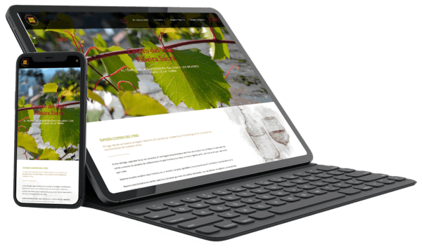
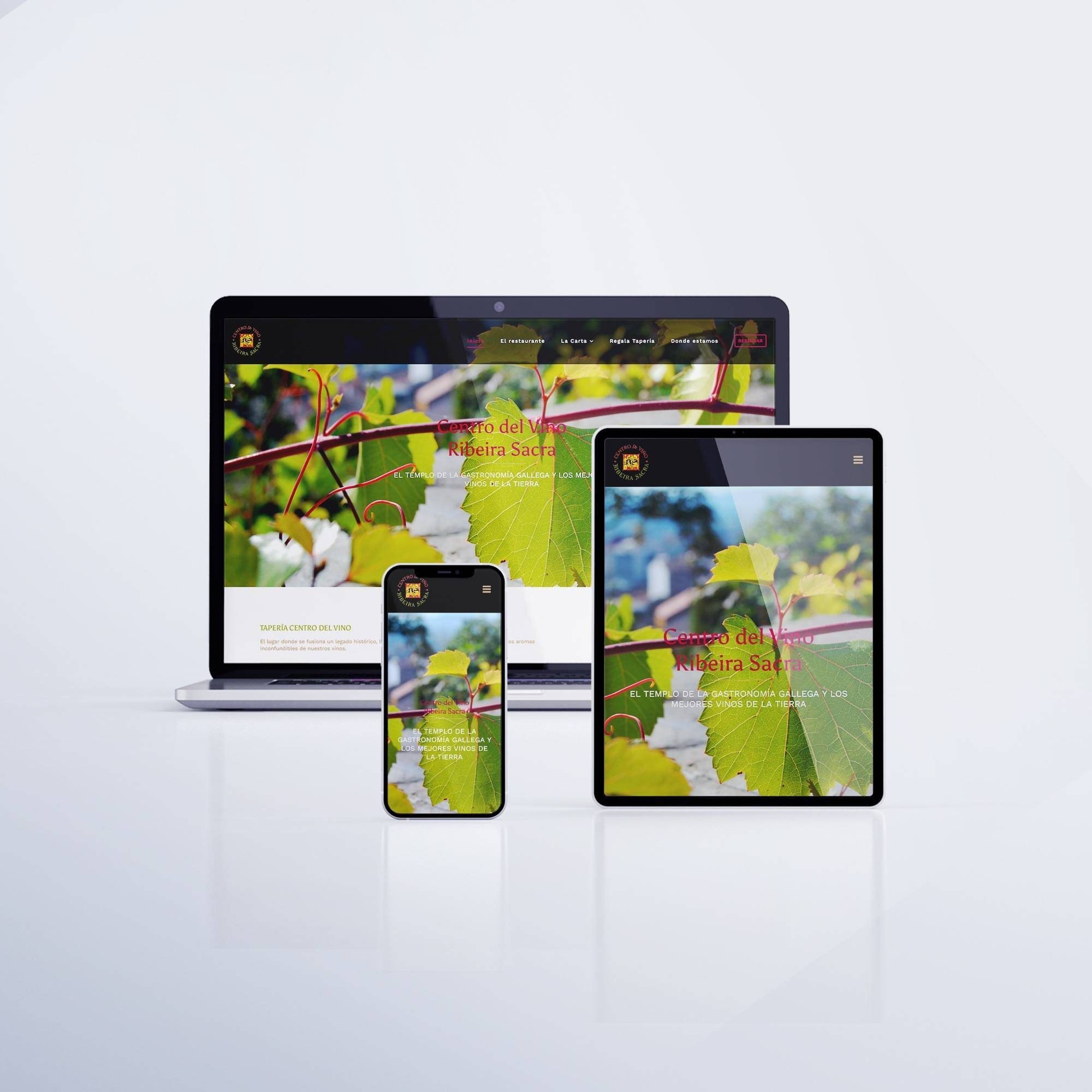
On the other hand, the rapid development of the latest generation mobile devices such as Smartphones, iPads, Tablets, etc … and the increase in the use of these to access the Internet and browse, have forced all web developers to adapt all their projects for their visual presentation automatically on all mobile devices on the market, or what is the same, Responsive web design .
The webs with responsive design differ from Classic designs in which the latter are only optimized for visual presentation on desktop PC computers, and those with responsive web design are automatically adapted to each screen size of all computers and mobile devices on the market, being 100% compatible and adequate navigation from any device and automatically.
Until now, what happened in classic designs is that if a person tried to visit the web from a mobile device, the web structure was not optimized for that device, so the elements were not displayed correctly. The user had to zoom or scroll to view the entire web. In this way, many developers created a website for viewing on computers and another in a mobile version for viewing on other devices, separately. What this entailed was an increase in programming and web development costs and the fact of having two web versions with different appearance.
In responsive design, the technique to adapt the display in these designs is as simple as saying that as the size of the browser window is reduced, the elements of the web adapt in size and shape, reorganizing themselves to be able to be viewed correctly without undergoing excessive modifications to the structure of the website or its appearance.
Responsive web designs are and will be the future of web development for several years. Few developers or web designers use classic designs in their web templates. However, depending on the type of website that you intend to create, on some occasions, it is not recommended or it is not feasible to do it in a responsive design. This is due to the use of some plugins or elements of the web that do not support this technology (for example, online editors of designs for customizing t-shirts, business cards, brochures, etc …) and for this reason they continue to maintain a classic web design .